*
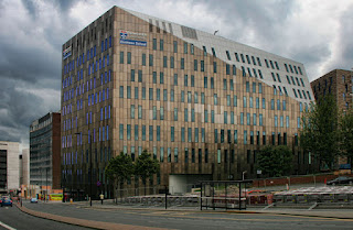
From the in-expensive, symmetrical and narrowly-functional glass-steel-and-concrete-brick
to
the expensive, a-symmetrical, dys-functional glass-steel-and-concrete-brick.
*
FROM:
AND:
.....TO:
AND:
AND:
*


9 comments:
In picture number four, the red brick building behind the modern monstrosity is very pleasing to the eye!
@JP - yes, I agree; it is a decent bit of Victorian business architecture.
It used to be a part of Newcastle University, but they flogged it - helping, no doubt, raise money to use constructing ever more, ever-more-expensive expensive assymetrical boxes.
It also shares my first name. Here it is as it was:
http://sine.ncl.ac.uk/learning_journeys/generic.asp?albumid=10
Not that I like either style, but I find current architecture to be marginally less ugly than mid-twentieth century Brutalism. (When considering the latter, one is also delighted in the apt, albeit unintended, double-meaning of that school!)
As you pointed out, there was actually something to be said for early modernist architecture (as there was for early modernity itself). There is nothing to be said for what moderism has turned into. A point very well made in a few pictures.
I should point at that these examples all come from within a single university.
You know all those Ancient Barrows? It's my theory that what happened was that the Lumps of Stone People erected ugly monuments, and their successors, the Architectural Criticism Folk, covered them with earth.
Hard just to look up and see these monstrosities. I can almost hear the thoughts that go into these. The hedonistic, evil, atheistic, thoughts. I can see the business meetings where briefcased women talk earnestly about the structure "opening up a space where people can connect."
70 years later, when they're all dead, the young have to sit in noisy, smelly, stuffy, cacophonous study rooms, that encourage the same disregard for their fellow people their creators had.
Perhaps one shouldn't comment on very-old posts, but I thought this article was relevant and interesting:
http://www.greenbuildingadvisor.com/articles/dept/musings/quality-issues-brick-buildings
A lot of modernists were unaware the details and beauty were often functional, while the modern architecture is neither beautiful or functional.
@Nat - Agreed. Neither is it cheap.
Post a Comment